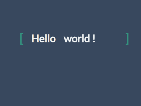
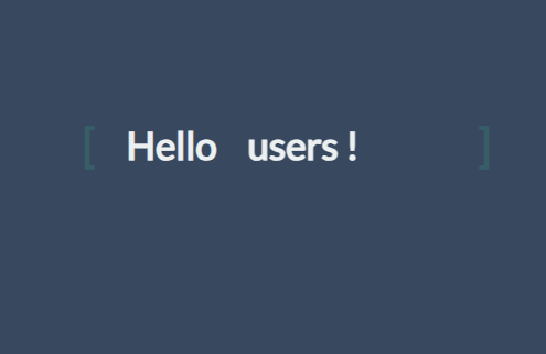
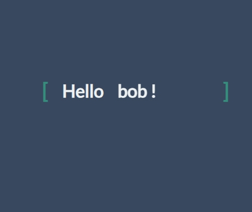
css로 텍스트가 위아래로 이동하는 애니메이션 입니다.
HTML
<link href="https://fonts.googleapis.com/css?family=Lato" rel="stylesheet">
<div class="content">
<div class="content__container">
<p class="content__container__text">
Hello
</p>
<ul class="content__container__list">
<li class="content__container__list__item">world !</li>
<li class="content__container__list__item">bob !</li>
<li class="content__container__list__item">users !</li>
<li class="content__container__list__item">everybody !</li>
</ul>
</div>
</div>
CSS
body {
width: 100%;
height: 100%;
position: fixed;
background-color: #34495e;
}
.content {
position: absolute;
top: 50%;
left: 50%;
transform: translate(-50%, -50%);
height: 160px;
overflow: hidden;
font-family: "Lato", sans-serif;
font-size: 35px;
line-height: 40px;
color: #ecf0f1;
}
.content__container {
font-weight: 600;
overflow: hidden;
height: 40px;
padding: 0 40px;
}
.content__container:before {
content: "[";
left: 0;
}
.content__container:after {
content: "]";
position: absolute;
right: 0;
}
.content__container:after, .content__container:before {
position: absolute;
top: 0;
color: #16a085;
font-size: 42px;
line-height: 40px;
-webkit-animation-name: opacity;
-webkit-animation-duration: 2s;
-webkit-animation-iteration-count: infinite;
animation-name: opacity;
animation-duration: 2s;
animation-iteration-count: infinite;
}
.content__container__text {
display: inline;
float: left;
margin: 0;
}
.content__container__list {
margin-top: 0;
padding-left: 110px;
text-align: left;
list-style: none;
-webkit-animation-name: change;
-webkit-animation-duration: 10s;
-webkit-animation-iteration-count: infinite;
animation-name: change;
animation-duration: 10s;
animation-iteration-count: infinite;
}
.content__container__list__item {
line-height: 40px;
margin: 0;
}
@-webkit-keyframes opacity {
0%, 100% {
opacity: 0;
}
50% {
opacity: 1;
}
}
@-webkit-keyframes change {
0%, 12.66%, 100% {
transform: translate3d(0, 0, 0);
}
16.66%, 29.32% {
transform: translate3d(0, -25%, 0);
}
33.32%, 45.98% {
transform: translate3d(0, -50%, 0);
}
49.98%, 62.64% {
transform: translate3d(0, -75%, 0);
}
66.64%, 79.3% {
transform: translate3d(0, -50%, 0);
}
83.3%, 95.96% {
transform: translate3d(0, -25%, 0);
}
}
@keyframes opacity {
0%, 100% {
opacity: 0;
}
50% {
opacity: 1;
}
}
@keyframes change {
0%, 12.66%, 100% {
transform: translate3d(0, 0, 0);
}
16.66%, 29.32% {
transform: translate3d(0, -25%, 0);
}
33.32%, 45.98% {
transform: translate3d(0, -50%, 0);
}
49.98%, 62.64% {
transform: translate3d(0, -75%, 0);
}
66.64%, 79.3% {
transform: translate3d(0, -50%, 0);
}
83.3%, 95.96% {
transform: translate3d(0, -25%, 0);
}
}
코드 및 데모는 데모링크를 통해서 확인하실 수 있습니다.
|


