|
@import url("https://fonts.googleapis.com/css2?family=Quicksand:wght@300&display=swap");
* {
margin: 0;
padding: 0;
box-sizing: border-box;
font-family: "Quicksand", sans-serif;
}
body {
display: flex;
justify-content: center;
align-items: center;
min-height: 100vh;
background: #111;
width: 100%;
overflow: hidden;
}
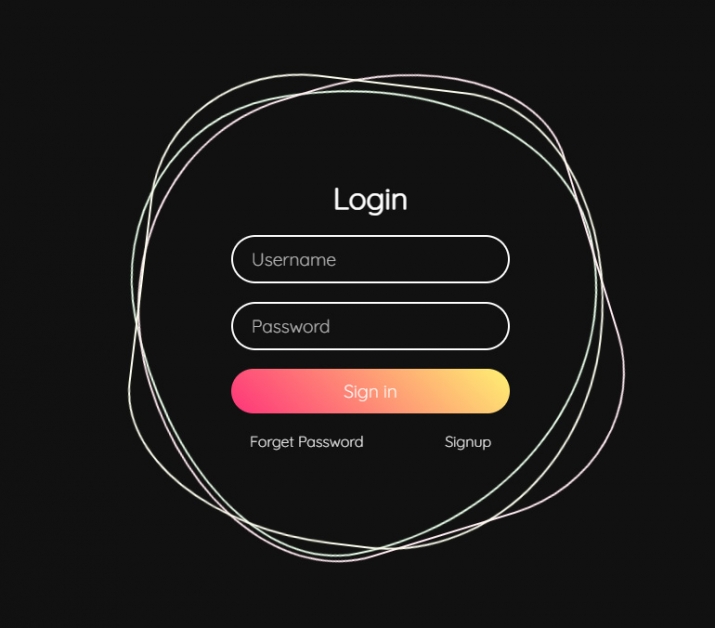
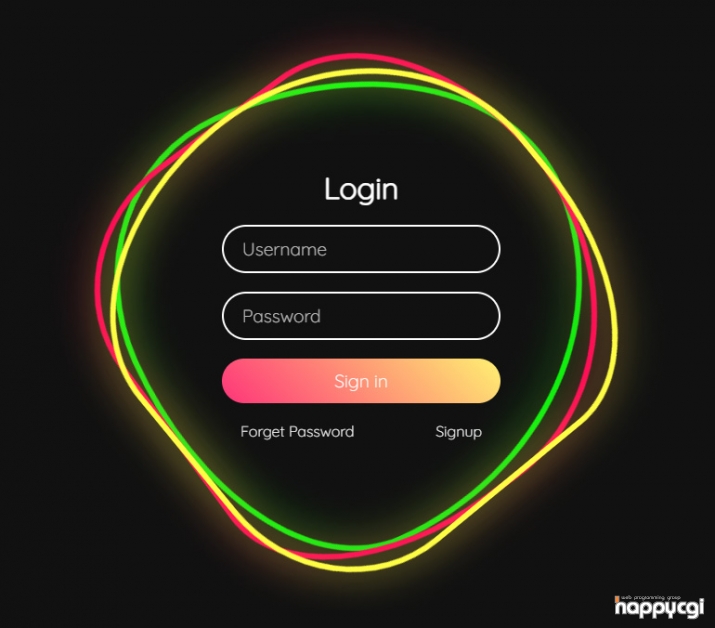
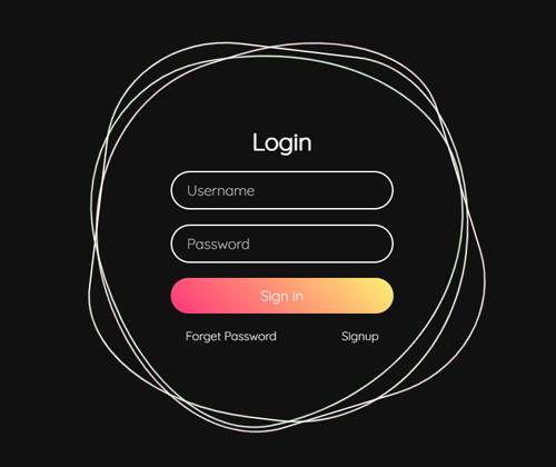
.ring {
position: relative;
width: 500px;
height: 500px;
display: flex;
justify-content: center;
align-items: center;
}
.ring i {
position: absolute;
inset: 0;
border: 2px solid #fff;
transition: 0.5s;
}
.ring i:nth-child(1) {
border-radius: 38% 62% 63% 37% / 41% 44% 56% 59%;
animation: animate 6s linear infinite;
}
.ring i:nth-child(2) {
border-radius: 41% 44% 56% 59%/38% 62% 63% 37%;
animation: animate 4s linear infinite;
}
.ring i:nth-child(3) {
border-radius: 41% 44% 56% 59%/38% 62% 63% 37%;
animation: animate2 10s linear infinite;
}
.ring:hover i {
border: 6px solid var(--clr);
filter: drop-shadow(0 0 20px var(--clr));
}
@keyframes animate {
0% {
transform: rotate(0deg);
}
100% {
transform: rotate(360deg);
}
}
@keyframes animate2 {
0% {
transform: rotate(360deg);
}
100% {
transform: rotate(0deg);
}
}
.login {
position: absolute;
width: 300px;
height: 100%;
display: flex;
justify-content: center;
align-items: center;
flex-direction: column;
gap: 20px;
}
.login h2 {
font-size: 2em;
color: #fff;
}
.login .inputBx {
position: relative;
width: 100%;
}
.login .inputBx input {
position: relative;
width: 100%;
padding: 12px 20px;
background: transparent;
border: 2px solid #fff;
border-radius: 40px;
font-size: 1.2em;
color: #fff;
box-shadow: none;
outline: none;
}
.login .inputBx input[type="submit"] {
width: 100%;
background: #0078ff;
background: linear-gradient(45deg, #ff357a, #fff172);
border: none;
cursor: pointer;
}
.login .inputBx input::placeholder {
color: rgba(255, 255, 255, 0.75);
}
.login .links {
position: relative;
width: 100%;
display: flex;
align-items: center;
justify-content: space-between;
padding: 0 20px;
}
.login .links a {
color: #fff;
text-decoration: none;
}
|


