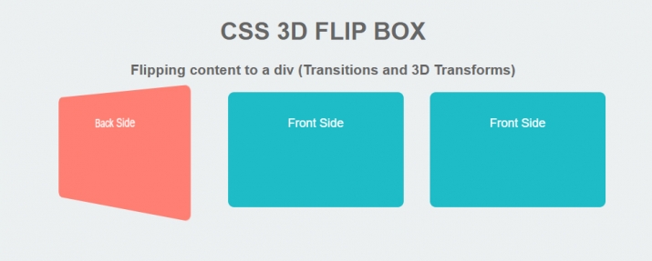
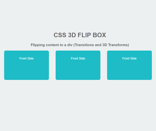
CSSИІ ШАПыЧб 3D flip ЙкНКРдДЯДй.
- CSS 3D ЧУИГ ЙкНК. divЗЮ ФмХйУї ЕкС§Бт ( РќШЏ Йз 3D КЏЧќ ). ОеИщ. ЕоИщ. ОеИщ. ЕоИщ. ОеИщ. ЕоИщ.
body {
background-color: #ecf0f1;
margin: 20px;
font-family: Arial, Tahoma;
font-size: 20px;
color: #666666;
text-align: center;
}
p { color: #ffffff; }
/*-=-=-=-=-=-=-=-=-=-*/
/* Column Grids */
/*-=-=-=-=-=-=-=-=-= */
.col_half { width: 49%; }
.col_third { width: 32%; }
.col_fourth { width: 23.5%; }
.col_fifth { width: 18.4%; }
.col_sixth { width: 15%; }
.col_three_fourth { width: 74.5%;}
.col_twothird{ width: 66%;}
.col_half,
.col_third,
.col_twothird,
.col_fourth,
.col_three_fourth,
.col_fifth{
position: relative;
display:inline;
display: inline-block;
float: left;
margin-right: 2%;
margin-bottom: 20px;
}
.end { margin-right: 0 !important; }
/*-=-=-=-=-=-=-=-=-=-=- */
/* Flip Panel */
/*-=-=-=-=-=-=-=-=-=-=- */
.wrapper{ width: 980px; margin: 0 auto; background-color: #bdd3de; hoverflow: hidden;}
.panel {
margin: 0 auto;
height: 130px;
position: relative;
-webkit-perspective: 600px;
-moz-perspective: 600px;
}
.panel .front,
.panel .back {
text-align: center;
}
.panel .front {
height: inherit;
position: absolute;
top: 0;
z-index: 900;
text-align: center;
-webkit-transform: rotateX(0deg) rotateY(0deg);
-moz-transform: rotateX(0deg) rotateY(0deg);
-webkit-transform-style: preserve-3d;
-moz-transform-style: preserve-3d;
-webkit-backface-visibility: hidden;
-moz-backface-visibility: hidden;
-webkit-transition: all .4s ease-in-out;
-moz-transition: all .4s ease-in-out;
-ms-transition: all .4s ease-in-out;
-o-transition: all .4s ease-in-out;
transition: all .4s ease-in-out;
}
.panel .back {
height: inherit;
position: absolute;
top: 0;
z-index: 1000;
-webkit-transform: rotateY(-180deg);
-moz-transform: rotateY(-180deg);
-webkit-transform-style: preserve-3d;
-moz-transform-style: preserve-3d;
-webkit-backface-visibility: hidden;
-moz-backface-visibility: hidden;
-webkit-transition: all .4s ease-in-out;
-moz-transition: all .4s ease-in-out;
-ms-transition: all .4s ease-in-out;
-o-transition: all .4s ease-in-out;
transition: all .4s ease-in-out;
}
.panel.flip .front {
z-index: 900;
-webkit-transform: rotateY(180deg);
-moz-transform: rotateY(180deg);
}
.panel.flip .back {
z-index: 1000;
-webkit-transform: rotateX(0deg) rotateY(0deg);
-moz-transform: rotateX(0deg) rotateY(0deg);
}
.box1{
background-color: #14bcc8;
width: 250px;
height: 150px;
margin: 0 auto;
padding: 20px;
border-radius: 10px;
-moz-border-radius: 10px;
-webkit-border-radius: 10px;
}
.box2{
background-color: #ff7e70;
width: 250px;
height: 150px;
margin: 0 auto;
padding: 20px;
border-radius: 10px;
-moz-border-radius: 10px;
-webkit-border-radius: 10px;
}


