* {
margin: 0;
box-sizing: border-box;
}
:root {
--bg: #020617;
--c1: #38bdf8;
--c2: #a855f7;
--c3: #22c55e;
--noise: rgba(255, 255, 255, 0.05);
}
body {
font-family: system-ui, sans-serif;
background: radial-gradient(circle at 20% 10%, #1e293b, transparent 60%),
radial-gradient(circle at 80% 90%, #020617, transparent 70%), var(--bg);
color: white;
overflow-x: hidden;
}
/* grain */
body::after {
content: "";
position: fixed;
inset: 0;
background: repeating-radial-gradient(
circle,
var(--noise) 0 1px,
transparent 1px 2px
);
mix-blend-mode: overlay;
pointer-events: none;
opacity: 0.35;
animation: grain 0.25s steps(2) infinite;
}
@keyframes grain {
to {
transform: translate(2px, -2px);
}
}
/* layout */
section {
min-height: 100vh;
display: grid;
place-items: center;
padding: 5rem 2rem;
perspective: 1000px;
}
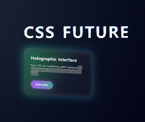
/* glitch title */
.glitch {
position: relative;
font-size: clamp(3rem, 9vw, 6rem);
font-weight: 900;
letter-spacing: 0.08em;
margin-bottom: 4rem;
}
.glitch::before,
.glitch::after {
content: attr(data-text);
position: absolute;
inset: 0;
opacity: 0.8;
}
.glitch::before {
color: var(--c1);
transform: translate(3px, -2px);
mix-blend-mode: screen;
animation: glitch 2s infinite alternate;
}
.glitch::after {
color: var(--c2);
transform: translate(-3px, 2px);
mix-blend-mode: screen;
animation: glitch 1.5s infinite alternate-reverse;
}
@keyframes glitch {
0% {
clip-path: inset(0 0 70% 0);
}
25% {
clip-path: inset(20% 0 40% 0);
}
50% {
clip-path: inset(40% 0 20% 0);
}
75% {
clip-path: inset(10% 0 60% 0);
}
100% {
clip-path: inset(0 0 0 0);
}
}
/* holographic card */
.card {
width: min(420px, 90vw);
padding: 2.5rem;
border-radius: 28px;
background: linear-gradient(
120deg,
rgba(255, 255, 255, 0.08),
rgba(255, 255, 255, 0.02)
);
backdrop-filter: blur(16px);
box-shadow: 0 0 50px rgba(56, 189, 248, 0.35),
inset 0 0 35px rgba(255, 255, 255, 0.15);
transform-style: preserve-3d;
animation: float 6s ease-in-out infinite;
position: relative;
}
.card::before {
content: "";
position: absolute;
inset: -2px;
background: linear-gradient(
120deg,
transparent 20%,
var(--c1),
var(--c2),
var(--c3),
transparent 80%
);
filter: blur(25px);
opacity: 0.4;
z-index: -1;
animation: holo 4s linear infinite;
background-size: 400% 100%;
}
@keyframes holo {
to {
background-position: 400% 0;
}
}
@keyframes float {
0%,
100% {
transform: rotateX(12deg) rotateY(-10deg) translateY(0);
}
50% {
transform: rotateX(18deg) rotateY(12deg) translateY(-25px);
}
}
.card h2 {
font-size: 1.7rem;
margin-bottom: 1rem;
}
.card p {
line-height: 1.6;
opacity: 0.85;
}
/* holographic button */
.btn {
display: inline-block;
margin-top: 2rem;
padding: 0.9rem 1.8rem;
border-radius: 999px;
font-weight: 600;
letter-spacing: 0.08em;
color: white;
text-decoration: none;
background: linear-gradient(90deg, var(--c1), var(--c2), var(--c3));
background-size: 300% 100%;
animation: holo 3s linear infinite;
box-shadow: 0 0 25px rgba(168, 85, 247, 0.6);
}


