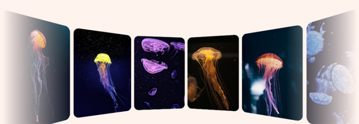
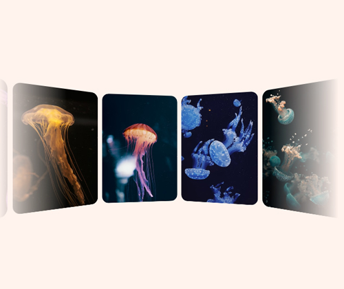
마우스 움직임에 따라 카드가 자연스럽게 기울어지며
입체적으로 반응하는 3D 인터랙션 효과를 CSS로 구현한 예제입니다.
transform, perspective, hover 속성을 활용하여
별도의 JavaScript 없이도 카드가 실제로 움직이는 듯한 동적인 UI 효과를 표현할 수 있습니다.
카드형 레이아웃, 서비스 소개 영역, 상품 리스트 등 다양한 UI 디자인에 적용하기 좋으며,
간단한 코드만으로도 세련된 인터랙션을 구현할 수 있는 효과적인 예제입니다.
HTML 구조
- const DATA = [
- '1540968221243-29f5d70540bf',
- '1596135187959-562c650d98bc',
- '1628944682084-831f35256163',
- '1590013330451-3946e83e0392',
- '1590421959604-741d0eec0a2e',
- '1572613000712-eadc57acbecd',
- '1570097192570-4b49a6736f9f',
- '1620789550663-2b10e0080354',
- '1617775623669-20bff4ffaa5c',
- '1548600916-dc8492f8e845',
- '1573824969595-a76d4365a2e6',
- '1633936929709-59991b5fdd72'
- ];
- const N = DATA.length;
.scene
.a3d(style=`--n: ${N}`)
- for(let i = 0; i < N; i++)
img.card(src=`https://images.unsplash.com/photo-${DATA[i]}?w=280`
style=`--i: ${i}` alt='jellyfish')
//- generates this kind of HTML:
//- <div class="scene">
//- <div class="a3d" style="--n: 12">
//- <img class="card" src="image0.jpg" style="--i: 0" alt="image description"/>
//- <img class="card" src="image1.jpg" style="--i: 1" alt="image description"/>
//- <!-- the rest of the cards -->
//- </div>
//- </div>
CSS 소스
/* ====== Relevant CSS ====== */
.scene, .a3d { display: grid }
.scene {
/* prevent scrollbars */
overflow: hidden;
/* for 3D look; smaller = more extreme effect */
perspective: 35em;
mask: /* lateral fade */
linear-gradient(90deg,
#0000, red 20% 80%, #0000)
}
.a3d {
place-self: center /* middle align */;
/* don't flatten 3D transformed children
* of this parent having its own 3D transform */
transform-style: preserve-3d;
animation: ry 32s linear infinite
}
/* simplest y axis rotation */
@keyframes ry { to { rotate: y 1turn } }
.card {
/* base card width, you may change this */
--w: 17.5em;
/* compute base angle corresponding to a card */
--ba: 1turn/var(--n); /* in the future: sibling-count() */
grid-area: 1/ 1 /* stack in same one grid cell */;
width: var(--w);
aspect-ratio: 7/ 10;
object-fit: cover;
border-radius: 1.5em;
/* don't want to see back of cards in front of screen plane */
backface-visibility: hidden;
/* need to use a transform chain here, cannot use separate
* rotate & translate properties because they'd be applied
* in wrong order (translate, then rotate) for what we need */
transform:
/* rotate around y axis; in the future: sibling-index() */
rotatey(calc(var(--i)*var(--ba)))
/* only after that translate along z axis with minus */
translatez(calc(-1*(.5*var(--w) + .5em)/tan(.5*var(--ba))))
}
@media (prefers-reduced-motion: reduce) {
.a3d { animation-duration: 128s }
}
/* ====== General page prettifying and layout ====== */
html, body { display: grid }
html { height: 100% }
body { background: #fff3ed }


